
Design reference: this page is not presented as a completed Benson Display client project. Use the layout and fixture ideas to describe your own requirements; specifications and project scope need separate confirmation.
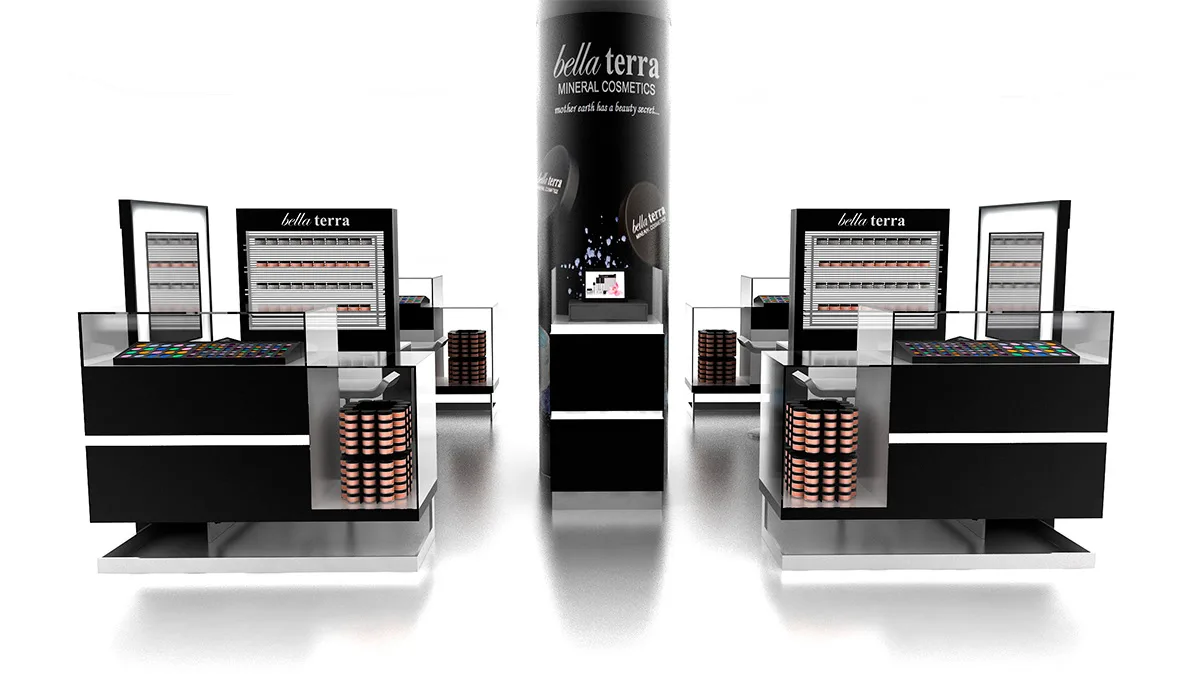
Have you ever visited a beauty kiosk for makeup? What do you value most when you’re there? Today, let me introduce you to Bella Terra Beauty Kiosk, which has become a standout example in beauty retail thanks to its unique design, smart layout, clever display setups, and high-quality materials. Here’s a closer look at what makes it special.
Design Features
- Black and White Theme:Bella Terra Beauty Kiosk uses a black-and-white color scheme to create a classic yet modern vibe. Black symbolizes mystery and elegance, giving the kiosk a sophisticated feel, while white adds brightness and simplicity, making the space feel open and airy. The contrast between the two colors is striking but not overwhelming, easily catching the attention of passersby.
- Attention to Detail:The black parts of the kiosk, like the matte-finished cabinets, look understated yet high-quality. The white sections, such as the smooth edges of display tables, are clean and neat. The kiosk avoids overly complicated decorations, using only simple lines or geometric patterns in key areas to enhance its modern and stylish look. This design keeps the focus on the beauty products, highlighting their colors and textures.
Space Layout
- Product Display Area
The product display area takes up most of the kiosk’s space, with items arranged by category. For example, there are separate sections for foundation, eye makeup, and lip products. Within each section, products are organized logically—like foundation shades and types—making it easy for customers to find what they need. - Try-On Zone
Next to the display area is the try-on zone, equipped with comfortable chairs, bright mirrors, and all the necessary tools. After browsing, customers can test products here to see how they look and feel. The zone also provides makeup removers and cleaning tools, ensuring a safe and convenient experience. - Interactive Display Area
The interactive area features digital screens that play product tutorials, brand stories, and other content. Customers can learn more about the products and the brand, building trust and interest. - This clear layout ensures a smooth shopping experience, allowing customers to browse, try, and buy products effortlessly.
Display Cabinet Design
- Open Shelving
The kiosk uses open shelves made of metal frames and wooden panels. These shelves are sturdy yet natural-looking, with carefully designed heights and spacing to fit products of different sizes. The open design lets customers touch and pick items directly, making shopping more interactive and engaging. - Glass Display Cases
For premium products or sets, the kiosk uses glass display cases. The high-transparency glass clearly shows the products’ details, while professional lighting highlights their colors and textures, making them stand out. - Rotating Displays
To make the most of the space, the kiosk includes rotating display stands. These 360-degree stands let customers view products from all angles, increasing visibility and adding a fun, dynamic touch to the kiosk.
Conclusion
Bella Terra Beauty Kiosk stands out for its thoughtful design, smart layout, and high-quality materials. It offers customers a comfortable and convenient shopping experience while supporting the brand’s growth and promotion. With its classic design, practical layout, and premium materials, Bella Terra has become a leader in beauty retail, attracting countless customers and setting a new standard in the industry.