
Design reference: this page is not presented as a completed Benson Display client project. Use the layout and fixture ideas to describe your own requirements; specifications and project scope need separate confirmation.
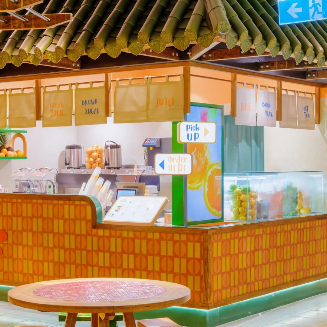
Summer Vibe is an open‑concept juice kiosk inside a mall food court. It features a tropical fresh‑fruit style mixed with casual urban market elements. It boasts vibrant colour schemes and highly recognisable forms. Its layout caters to beverage retail needs and balances visual appeal with practical performance.
Exterior Appearance
Retro patterned tiles form the core element of the store facade. Continuous geometric‑pattern tiles in interwoven orange and warm yellow cover the full counter wall. Neat tilework delivers consistent patterns that match the warm colour palette of fresh‑fruit drinks. Wood trims frame the counter edges to soften the rigid look of tiles and add depth to the facade. A full‑length teal LED strip runs along the bottom of the counter and stays lit constantly. Up‑diffused lighting reduces the visual bulk of the counter and makes the kiosk stand out amid mall lighting.
At the centre of the counter sits a custom‑made brand neon installation shaped like a bitten orange slice, echoing the store’s fresh‑fruit focus. Neon tubes trace hand‑lettered brand logotype, flanked by three‑dimensional juice‑splash ornaments for a lively visual effect. A large‑format lightbox poster stands on the outer wall of the kiosk. It adopts the same citrus‑themed graphic and uses blocks of orange, teal and off‑white as its background. It enables clear brand recognition from afar, replaces conventional partition panels and beautifies the outer wall.
Upper‑level Soft Furnishings
Numerous fabric decorations attach to the top beams above the kiosk. Multiple off‑white and cream canvas banners hang staggered over the service counter and work zone. These banners vary in size and hang at different heights. They do not block interior lighting or customer sightlines, while filling empty overhead space for a fuller visual presentation. Each banner prints core product categories such as juice and brown‑sugar drinks. Passers‑by can quickly grasp what the store sells.
Canvas brings soft textural quality to counteract the hard, cold feel of roof tiles, ceramic tiles and metal equipment. It infuses this mall‑based kiosk with the laid‑back atmosphere of street‑market shops. Banners hang in balanced, well‑spaced arrangement without looking cluttered. These soft decorations deliver strong visual impact at low cost and allow easy replacement for seasonal business adjustments. Upper‑level decorations coordinate with counter‑level features, building a cohesive visual system from top to bottom and greatly elevating overall refinement.
Functional Circulation
The kiosk adopts a left‑and‑right zoning layout, strictly separating the ordering zone from the pickup zone to meet fast‑service beverage business requirements. Two freestanding signboards sit at the kiosk corner for ordering and collection respectively. The left signboard with text and arrow guides customers to place and pay for orders in the designated spot. The right signboard marks the pickup point to prevent customer crowding.
Behind the signboards stands a vertical digital screen. It loops drink photos, new‑product releases and promotional content. Positioned along main foot traffic, it continuously catches passers‑by’ attention for on‑site marketing. A fixed physical menu board rests on the countertop. Its well‑organised layout displays categories, item options and prices. Customers can view full menus while standing at the ordering spot and reduce repeated enquiries to staff, speeding up ordering.
Back‑of‑house circulation follows staff workflows. Equipment, supplies and work surfaces line up sequentially. Staff complete order receiving, drink preparation and hand‑over within a compact zone without excessive walking. Customer pathways and staff working zones stay fully separated. No cross‑interference occurs. This arrangement minimises congestion and chaos during peak hours and supports smooth high‑volume operations.
Interior Furnishings
A custom‑built green shelving unit mounts on the back wall of the preparation zone. Its edges carry curved orange arch‑shaped trims with smooth outlines. These arch motifs echo the citrus neon sign on the front counter and maintain design consistency across inside and outside spaces. Artificial oranges, pineapples and other fruit ornaments neatly sit on shelf surfaces. They visually communicate the store’s fresh‑fruit positioning and strengthen customer perception of raw‑material quality.
Work countertops remain tidy. Juicers, refrigeration units, straw holders, cup storage and supply boxes arrange in sequence following beverage‑making workflows. Every item has its fixed storage spot with no redundant clutter. This setup supports quick staff access and lets customers observe clean preparation conditions. A fully transparent glass chiller embeds on the side of the kiosk to hold fresh fruit ingredients. Unobstructed glass lets passers‑by view raw materials directly, builds perceived freshness and boosts consumer trust.
Colour and Materials
- Colour Palette: Warm orange and yellow serve as primary colours, reflecting tropical fruit tones and aligning with product characteristics. Teal acts as the secondary accent colour applied to roof tiles, bottom light strips and wall shelves. It offsets the warmth of dominant hues and creates a refreshing summer mood. Natural wood tone moderates highly saturated colours. It prevents visual chaos while retaining bright, energetic tones.
- Material Application: Matte patterned ceramic tiles clad counter facades. They resist wear and stains and support easy daily cleaning. Solid wood makes counter frames, roof beams and outdoor tables for gentle organic texture. Canvas fabric forms overhead banners for light‑weight, atmospheric soft decor. Neon light tubing constructs brand signage for soft glow and trendy styling. Clear glass serves display needs with high transparency. Simulation roof tiles deliver authentic visual effects purely for decoration purposes.
Overall Highlights
- All forms, colours and furnishings revolve around the fresh‑fruit summer theme with no redundant decorative elements.
- Clear spatial divisions and well‑thought‑out circulation satisfy both customer experience and staff efficiency, fitting high‑frequency retail scenarios in shopping malls.
- Distinctive colours and shapes make the kiosk stand out against plain mall storefronts. It draws foot traffic and delivers natural marketing advantages.
- Decorative elements balance aesthetics and practicality. Soft furnishings allow flexible updates, while hard‑wearing hardware supports long‑term commercial operation.