
Design reference: this page is not presented as a completed Benson Display client project. Use the layout and fixture ideas to describe your own requirements; specifications and project scope need separate confirmation.
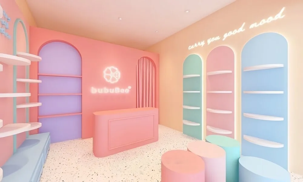
The light pink and light blue themed baby stores represented by “bubuBee” are redefining the healing feeling of the baby and maternity retail space with soft colors and dynamic displays. It not only caters to the emotional needs of the mother and baby group, but also enhances the consumption experience through professional functional design. It has achieved a precise balance between cuteness and practicality.
Theme color
bubuBee adopts a low-saturation color combination of light pink and light blue. It is a professional choice based on the psychological characteristics of the mother and baby group. Light pink is naturally soft and in line with the aesthetic preferences of female consumers. At the same time, it can relieve the anxiety brought by parenting. The light blue neutralizes the sweetness of the pink and adds a refreshing feeling. It is also more suitable for the colors of baby and maternal products.
The main color of the wall is light pink with a texture close to cream, complemented by light blue and light purple as accents. It not only ensures the unity of the space but also distinguishes the functional areas through color gradation. This color logic not only meets the visual communication needs of the internet-famous store but also realizes the emotional healing value of the mother and baby space.
Reception desk
Shape: It adopts an integrated design with rounded corners and arcs. At the same time, the soft lines echo the overall soothing feeling of the space.
Color: The main body follows the main color of the space, light pink. The bottom is decorated with light blue panels. It not only enhances the unity of the theme color but also weakens the stiffness of the counter through color distinction.
Function: The width and height of the countertop are adapted to the scenarios of mothers and babies. It not only meets the operational requirements of cashiering and product packaging, but also facilitates communication and interaction among parents when they are holding their babies. The interior of the cabinet reserves storage space for baby and maternal products, achieving a dual realization of aesthetics and practicality.
Space: The reception desk is not an isolated counter but a hub connecting the display area and the rest area. Its curved edge naturally guides the flow of people towards the display wall, while forming a semi-open interactive area with the surrounding round stool rest area. Make the process of cashiering and consultation more humanized.
Wall Cabinets
Design: wall cabinets use a combination of curved lines and layers in their designs, along with the use of the curved edges to create a softer feel in this area. By using layers, filters help to organize items into groups or categories, allowing mothers and babies to organize items by size.
Color: theme colours including light blues and purple are used throughout the inside of cabinets, as well as lighting designs that help enhance the display of product items and create an inviting ambience.
Optimise: wall cabinet height is generally designed for both parents and children, allowing for direct visual access to product displays at the lower height while allowing for product visual access within the same range of vision as the eye level of adults.
Display Risers
Form: It adopts the design of round stools and low benches. It avoids the occupation of space by large display stands. At the same time, the rounded corner design meets the safety requirements of the maternal and infant scenarios.
Function: These display stands are not merely product placement stands. Rather, it is the core of scenario-based combination. For instance, baby bags, soothing toys and baby socks are displayed in combination on the same display stand. Simulate real scenarios to help parents quickly associate usage needs.
Interactivity: The height of the display stand is adapted to the baby’s range of movement. The baby can touch and take the product. This immersive experience not only satisfies the baby’s curiosity. It also enables parents to have a more intuitive understanding of the texture and safety of the product.
The light pink and light blue theme design of bubuBee is essentially a retail space centered on users’ emotions. From color to carrier, from shape to function, every design aspect is centered around the needs of the mother and baby group. If you are also planning to open a baby products store, you might as well consider this design.