
Design reference: this page is not presented as a completed Benson Display client project. Use the layout and fixture ideas to describe your own requirements; specifications and project scope need separate confirmation.
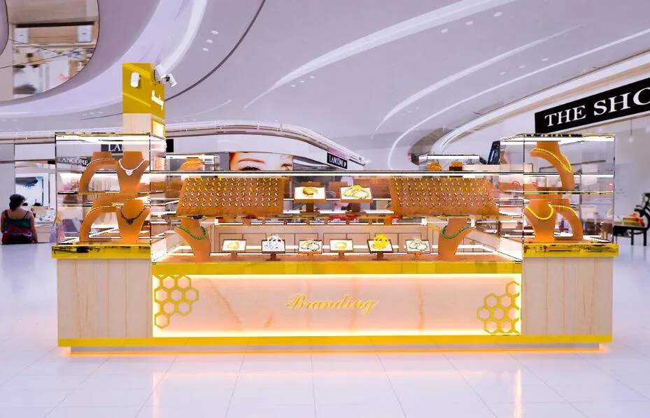
The Branding kiosk, a centerpiece in the retail landscape, is meticulously designed to enhance customer engagement and product visibility. Its layout, color details, and features are crafted to create a shopping experience that is both aesthetically pleasing and functionally efficient.
Product Layout
- The product layout of the Branding kiosk is a study in efficient use of space. The kiosk’s structure is divided into distinct sections, each tailored to display various types of products. The main counter is a focal point, featuring multiple display units that vary in height and size. This variation caters to the display needs of different products, ensuring each item is presented in an optimal manner.
- The display units are strategically placed to guide the customer’s gaze and movement around the kiosk. Transparent glass shelves are utilized to provide an unobstructed view of the products, allowing natural light to enhance their appeal. The central area of the kiosk is designed to showcase featured items, drawing customers in for a closer look.
- Additionally, the kiosk includes a checkout counter that is conveniently located for a seamless purchasing experience. The overall layout is designed to facilitate easy navigation, encouraging customers to explore the full range of products offered.
Color Details
- The color scheme of the Branding kiosk is carefully selected to create a luxurious and inviting atmosphere. The primary colors are beige and gold, which together create a warm and welcoming environment. Beige, a neutral tone, provides a clean and sophisticated backdrop that allows the products to stand out. It symbolizes purity and simplicity, complementing the high-end nature of the items on display.
- Gold accents are used sparingly but effectively, adding a touch of opulence and elegance to the kiosk. Gold is associated with quality and prestige, which helps to elevate the perceived value of the products. The honeycomb pattern, a recurring decorative element, is rendered in gold, tying together the kiosk’s design and reinforcing the brand’s identity.
- The use of color in the Branding kiosk is not only about aesthetics; it’s also functional. The chosen colors work together to highlight the products, guide customer movement, and create a cohesive brand experience.
Product Features
The Branding booth is designed with versatility in mind, making it suitable for a wide range of products. Its features are carefully considered to maximize functionality while maintaining a high level of aesthetic appeal.One of the key features is the use of high-quality materials, such as wood and metal, which provide durability and a refined look. The glass shelves not only protect the products but also add a touch of sophistication to the display. The kiosk’s lighting is another important feature, with both overhead and accent used lighting to create a warm and inviting ambiance.The kiosk also includes storage solutions, such as cabinets and drawers, which keep the space organized and clutter-free. This not only enhances the visual appeal but also makes it easier for staff to manage the products.
In conclusion, the Branding kiosk’s product layout, color details, and features are designed to create a shopping experience that is both engaging and efficient. By carefully considering the placement of products, the use of color, and the inclusion of functional features, the kiosk stands as a model of modern retail design.