Design reference: this page is not presented as a completed Benson Display client project. Use the layout and fixture ideas to describe your own requirements; specifications and project scope need separate confirmation.
Middle East Pharmacy
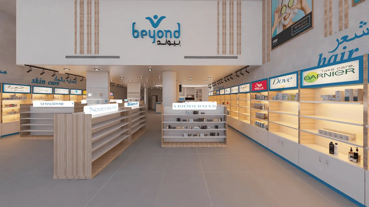
In response to the regional culture of the Middle East market, the store adopts a warm wood color as its base, complemented by a light grey matte floor and lake blue accents. This not only echoes the common wood texture and steady tones in Arab architecture but also dispels the solemnity of traditional medical Spaces through the freshness of lake blue. In terms of material selection, some parts of the wall are coated with cement-textured paint, and wooden decorative strips are used to add layers. The light grey tiles laid on the ground are dirt-resistant and easy to clean. The matte surface avoids visual fatigue caused by strong light reflection. The display cabinets are made of solid wood veneer and lacquered panels, ensuring durability while filling the entire space with a warm and cozy atmosphere.
Store layout
The store adopts a circulation line design of “entrance reception → central island display → wall zoning → exit diversion” : After entering through the glass door, customers are first attracted by the reception desk on the left, then naturally turn to the double-sided shelves on the central island, browse the various functional zones along the wall, and finally leave through the exit on the right. This layout not only makes full use of every inch of space, but also avoids the congestion of the “one-way street” style in traditional pharmacies. Customers can freely move between different areas and easily find the products they need.
Lighting design
The ceiling-embedded downlights provide basic ambient light, and the track lights precisely illuminate the core products of the wall cabinets and shelves. The LED light strips on the inner side of the shelves outline the contusions of the displayed items. This alternating light and dark lighting layout not only avoids the oppressive feeling of the “cold white light” in traditional pharmacies but also enables customers to clearly focus on the product details in a soft atmosphere. For example, in the “hair care” area, the warm yellow shelf lights complement the texture of the wooden display cabinets, making products such as shampoo and conditioner look more textured.
- Reception and consultation area: Located on the left side of the entrance, it is the first point of contact for customers to come into contact with the brand, and it also has the functions of cash register, consultation and image display.
- Personal care display area: Centered around the double-sided shelves on the central island and the wall-mounted cabinets, it showcases high-frequency personal care products such as hair care, skin care, and body care.
- Prescription service area: A semi-enclosed space hidden behind the reception desk, which ensures customer privacy while naturally connecting with the retail area.
- Leisure waiting area: On the right side of the entrance, wooden low tables and soft stools are set up for customers to wait or browse through health manuals, alleviating the fatigue during shopping.
Reception desk
The reception desk adopts a combination design of high and low platforms. The main body is covered with warm wood-colored solid wood veneer, and the edges are wrapped with lake blue baked paint. The “Beyond” brand LOGO (including the Arabic words “بي and ند”) is embedded in the middle. The hidden LED light strip below Outlines the front surface, creating a distinct brand memory point visually. The left side of the countertop reserves a computer space and a cash register equipment area, while the right side sets up an open storage compartment to facilitate staff to quickly access receipts and gifts. The closed cabinet below is used to store spare supplies, taking into account both image display and practical functions.
Wall cabinet
The custom-made display cabinets along the entire wall are the visual core of the store and are divided into four major modules by categories: “hair care”, “skin care”, “body care” and “hair colorant”. A hollowed-out backlit light box is set above each module, with Arabic logos at the front and English ones at the back, which conforms to the reading habits of local consumers. The cabinet body is made of adjustable solid wood shelves, with LED light strips installed on the inner side. The bottom is a closed storage space, and brand light boxes (such as L’Oreal, Dove, Garnier, etc.) are embedded on the top. The ultra-thin light boxes have a high degree of color reproduction and can quickly attract customers’ attention. The spacing between the shelves can be flexibly adjusted according to the product size. Large bottles of personal care products are placed on the lower layer, while small bottles of essence, lipsticks, etc. are placed on the upper layer, making the display more logical.
Double-sided shelf
The double-sided shelves in the central island area adopt a combination design of solid wood frames and light grey shelves. The double-sided transparent structure enables customers to easily retrieve goods from both sides, greatly enhancing the space utilization rate. Brand signboards (such as Signal, Neutrogena, Bioderma) are set on the top of the shelves. The white acrylic signboard with the brand LOGO stands out strikingly against the warm wood background. Anti-slip strips are installed along the edges of the shelves to prevent products from slipping. At the bottom, drawer-type storage compartments are added to store inventory goods and reduce the replenishment flow. This design turns the central island area into the “traffic engine” of the store. The concentrated display of high-frequency personal care products effectively increases the associated consumption rate.
- Zoned light box: It adopts hollowed-out characters + backlit technology, and combines Arabic with bilingual markings. For example, “العناية بالشعر” is marked beside “hair care”, which not only meets the needs of local customers but also takes into account the identification of foreign tourists.
- Brand light box: Embedded at the top of the wall-mounted cabinet, it uniformly adopts a lake blue border, echoing the overall color system. The light box images are regularly updated with promotional information to maintain a fresh visual effect.
- The LOGO light box: The “Beyond” logo above the entrance and at the reception desk is designed with acrylic three-dimensional characters and backlighting. Under the dual effect of natural light and artificial light, it becomes the most eye-catching visual symbol of the store.