
Design reference: this page is not presented as a completed Benson Display client project. Use the layout and fixture ideas to describe your own requirements; specifications and project scope need separate confirmation.
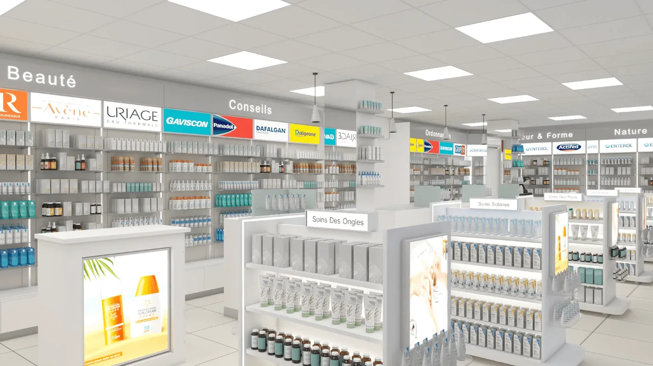
Modern pharmacy design
Pushing open the door of this pharmacy shop, the first thing that greets you is not the slightly dull smell of disinfectant found in traditional pharmacies, but rather a bright and transparent space filled with a clean atmosphere and a faint fragrance of skin care products. This is a pharmacy that integrates “practicality” and “body sensation” into every design, from the wall color to the shelf spacing, from the zoning signs to the display logic. Every detail is quietly telling customers: This is not only a place to buy medicine, but also a place where they can choose health and care products with peace of mind.
Open shelves
There are also quite a few open shelves beside the wall cabinets for supplementary display. The spacing between the shelf boards can be adjusted. When placing small bottles of health supplements, adjust the layer spacing to allow for more placement. When enlarging the bottle of body lotion, increasing the layer spacing will prevent it from looking crowded. Some shelves are also equipped with inclined shelves, allowing product labels to face customers directly – so that they can clearly see the ingredients and usage without picking them up. This is particularly practical for people in a hurry.
Wall cabinet design
Design details: The upper layer is made of transparent acrylic panels, allowing for a direct view of the small packages of products inside (such as ointments and sample skin care products). The middle layer is an open shelf, displaying commonly used medium-sized products (such as bottled health supplements and skin care lotions). The lower layer is a closed drawer or cabinet door, which is used to store inventory and large items (such as orthopedic protective gear, large packages of family-sized products).
Categorized display: For instance, in the “Orthopedie” section, the wall cabinet has wrist guards and knee pads on the upper layer, rehabilitation patches in the middle layer, and orthopedic insoles on the lower layer. The wall cabinets in the “Beaute” section are divided by brands – Avene, URIAGE, and OBAGI each occupy a separate area. There’s no need to rummage through the messy shelves; you can easily locate your target brand at a glance.
Island counter design
Detail design: All the island counters have white bases with rounded corners (to prevent customers from accidentally bumping into them), and the height of the shelves is just at the waist and abdomen of an adult – products can be reached without bending over. For instance, there is an island counter marked “Fards Maquillage (Makeup)”, with lipsticks and foundation placed in layers, and a light box embedded in the middle to display the main color shades. The island counter of “Soins Des Ongles (Nail Care)” is neatly stacked with nail polish and nail essence, and even the trial packs are placed in a prominent position.
Location: Most of these island counters are placed at the intersections of the passageways, which not only guide customers to stay but also do not block the flow of people. For instance, the island counter in the baby and mother section is precisely stuck at the junction of the main passageway and the Bebe section. Parents pushing baby strollers can easily pick up baby wipes or back cream to have a look.
Reception desk
The reception desk is not made tall and large like in traditional pharmacies shop, but uses a low white countertop. Its location is also quite ingenious – it’s stuck at the junction of the Beaute area and the main aisle. Whether you want to check out after purchasing skin care products or inquire about the usage of orthopedic products, you can quickly find the store clerk without the trouble of “running around to the checkout counter”.
The cash register equipment is embedded in the countertop, so it won’t look messy. A small display rack is attached beside the countertop, with band-aids, throat lozenges and other commonly used small items placed on it, making it convenient for customers to take them easily.
Layout area
As soon as you enter, the “Orthopedie” area is on your left, with a large white sign hanging above the wall cabinet. The products are arranged in the order of “light care → heavy support” : the upper layer consists of lightweight wrist guards and knee pads, the middle layer is rehabilitation gel and patches, and the lower layer is orthopedic insoles and lumbar supports. The open shelves nearby also display massage balls and soothing sprays, which can be regarded as supplements to the “rehabilitation auxiliary tools”.
In the middle of the store, slightly to the left, below the “Bebe” sign is the baby care section. On the wall cabinet are chicco’s baby bottles, baby cream and complementary food supplements, all in soft tones of light yellow and light blue. On the island stand, there are small packages of baby wipes and hip cream (for parents to try out samples first).
The “Beaute” section is the most diverse area in the store. The wall cabinets are classified by brand (NUXE’s natural skin care products, SVR’s functional products, and Avene’s hot spring water series each take up one section). The island counter is divided into sub-zones – “Beaute Au Natural” is for natural beauty, “Soins Des Ongles” is for nail care, and “Fards Maquillage” is for makeup.
On the other side of the store, the “Nature & Sante” section displays organic health products and plant extracts. The products are classified into “digestive regulation”, “immune enhancement” and “sleep improvement”. On the lower layer of the wall cabinet, there are large packages of family-sized vitamins – suitable for the whole family to use together. The atmosphere in this area is very soothing. The product packaging is all in simple natural color schemes, which perfectly echoes the positioning of “natural and healthy”.