
Design reference: this page is not presented as a completed Benson Display client project. Use the layout and fixture ideas to describe your own requirements; specifications and project scope need separate confirmation.
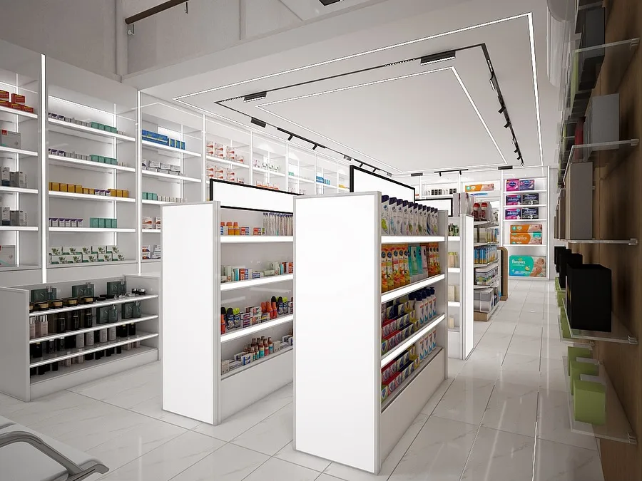
Walking into this pharmacy, you’re immediately struck by a sense of calm and clarity. The design leans into a modern, minimalist feel—think clean lines and a bright, airy atmosphere. A base of crisp white is warmed up with accents of natural wood, creating a space that feels both hygienically clean and genuinely inviting. It’s a clear departure from the often-cluttered pharmacy experience, building trust through its professional and orderly environment.
The real magic, however, lies in how this simple aesthetic is applied to the fixtures people actually interact with.
Smart Shelving that Guides You
The display shelving does more than just hold products; it helps you find what you need.
-
Design: The shelves continue the clean theme, mostly in white with touches of wood. The result is a sleek, uncluttered look that lets the products themselves take center stage.
-
The Experience: Everything is clearly zoned. Whether you’re looking for medicine, supplements, or first-aid supplies, you can find it quickly without confusion. Thoughtful lighting brightens the entire space and makes items pop. The mix of tall wall units and lower island shelves makes great use of the space, avoiding that cramped “warehouse” feeling.
-
A Closer Look:
-
The tall wall cabinets use open, adjustable white shelves, with some sections featuring elegant glass fronts for a more curated display.
-
The low island counters, with their simple white or wood frames, are perfect for browsing. They’re at just the right height to easily see smaller items like vitamins or promotional goods.
-
The Counter: Where Service Takes Center Stage
The counter area is the heart of the pharmacy, designed for both workflow and clear communication.
It picks up the same clean-lined and professional style as the shelving, finished in white with subtle wood-grain details. This isn’t just a place to pay; it’s the main hub for service.
-
The checkout counter is designed for efficiency, often in an L-shape, with smooth, easy-wipe surfaces and rounded corners for safety. Everything the staff needs, from computers to the POS system, is within easy reach.
-
The consultation and dispensing area is kept open and spacious. This gives the pharmacists room to work comfortably and provide confidential advice without feeling cramped. There’s even a dedicated space for health brochures or featured products. Most importantly, there’s plenty of room for customers to queue and talk comfortably with staff, making interactions feel personal rather than transactional.
In Summary
This pharmacy’s design proves that a healthcare environment can be both highly functional and beautifully calming. By focusing on a unified, minimalist style and tailoring every fixture—from the shelves to the counter—to the needs of both customers and staff, the space successfully promotes well-being through its very design. It feels less like a retail store and more like a partner in your health journey.