
Design reference: this page is not presented as a completed Benson Display client project. Use the layout and fixture ideas to describe your own requirements; specifications and project scope need separate confirmation.
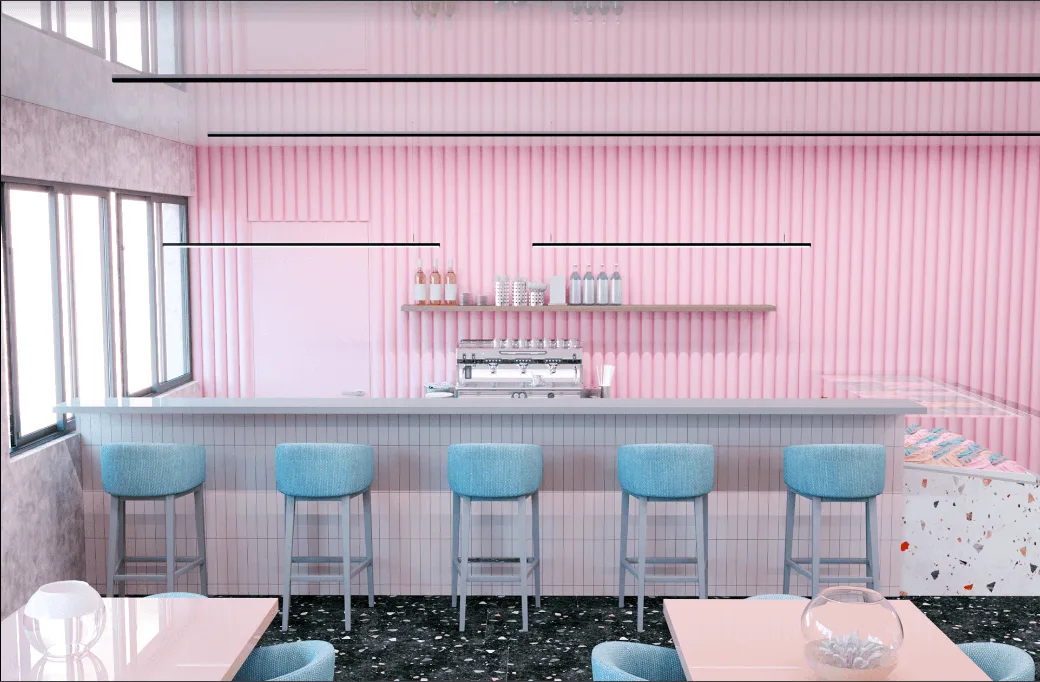
In the field of commercial space design, every detail carries the mission of attracting customers and conveying brand value. This project uses pink as the main tone, skillfully integrating various design elements to create a unique space that is both visually striking and functionally practical. From the careful selection of colors to the thoughtful use of materials, from the rational spatial layout to the meticulous lighting design, every aspect reflects the designer’s profound understanding and masterful control of the space. Next, we will analyze this design case in depth from multiple professional perspectives.
I. Color
Pink, as the dominant color of this project, is undoubtedly the soul of the entire space. In color psychology, pink symbolizes tenderness, romance, and sweetness, aligning perfectly with the joyful atmosphere expected in dessert or ice cream shops. Whether it’s the wavy pink walls or the textured pink backgrounds, each element reinforces this emotional expression in different ways. The wavy walls enhance the three-dimensional and dynamic feel of the space, preventing the pink from appearing monotonous, while the textured walls add a layer of delicacy and sophistication, immersing customers in a warm and sweet ambiance the moment they step inside.
An all-pink scheme might feel overly sweet, but the addition of blue chairs and gray sofas, and countertops strikes the perfect balance. Blue, as a cool tone, creates a striking contrast with pink, injecting freshness and vitality into the space. It not only provides visual balance but also offers customers a sense of calm and refreshment while indulging in sweet treats. Gray, as a neutral color, acts like a lubricant, softening the strong contrast between pink and blue and making the overall color scheme more harmonious. This strategic color pairing highlights the main theme while enriching the visual layers, delivering a comfortable and dynamic experience for customers.
II. Spatial Layout
Diverse Seating Arrangements: The space features various seating options to cater to different customer needs. The banquette seating along the walls, with gray sofas and pink countertops, creates a cozy and semi-private atmosphere, ideal for gatherings with friends or romantic dates. Here, customers can relax and enjoy quiet conversations. The bar area, equipped with blue high stools, offers a more open and interactive setting. It suits solo diners looking for a quick bite and facilitates casual interactions between customers and staff. Additionally, customers can observe the food preparation process up close, adding an element of fun and engagement. The combination of different seating types not only maximizes space utilization but also meets the needs of various customer groups in different scenarios.
Rational Functional Zoning: The overall layout demonstrates clear functional zoning. The left side likely serves as a display area for desserts or ice cream, with transparent showcases highlighting the products and attracting customer attention. The central bar area, equipped with preparation tools and storage, forms the core of food production. The surrounding dining area provides a comfortable eating environment. The well-designed circulation ensures smooth movement between zones, allowing customers to seamlessly complete activities like browsing and dining, enhancing both efficiency and convenience.
III. Materials
Wall Material: The wavy pink walls may be made of PVC corrugated panels or similar plastic materials. These are lightweight, easy to install, and maintain, while their textured surfaces effectively reflect light, enhancing the space’s three-dimensionality and play of shadows. The textured walls, possibly achieved with artistic coatings or specialty wallpapers, add a refined touch and durability, meeting the demands of commercial use.
Floor Material: The terrazzo-like flooring is not only wear-resistant and easy to clean but also complements the overall aesthetic with its granular texture. The dark floor contrasts sharply with the light walls and furniture, further emphasizing spatial depth. The unique texture of terrazzo also adds a fashionable and personalized touch, harmonizing with the pink theme to shape a distinctive ambiance.
Furniture Material: The chairs and sofas feature soft fabric upholstery, ensuring comfort for prolonged seating. The tactile and cozy nature of fabric prevents discomfort even during extended stays. Countertops, likely made of artificial stone or marble, offer a smooth and elegant surface that is both visually appealing and easy to maintain. These material choices prioritize practicality without compromising aesthetics, creating an excellent consumer environment.
Conclusion
In summary, this pink-themed store design meticulously blends color, spatial layout, materials, and lighting. It not only crafts a visually stunning and romantic space but also prioritizes functionality and customer experience, making it a successful case study that balances aesthetic and commercial value. It offers valuable insights for the field of commercial space design.