
Design reference: this page is not presented as a completed Benson Display client project. Use the layout and fixture ideas to describe your own requirements; specifications and project scope need separate confirmation.
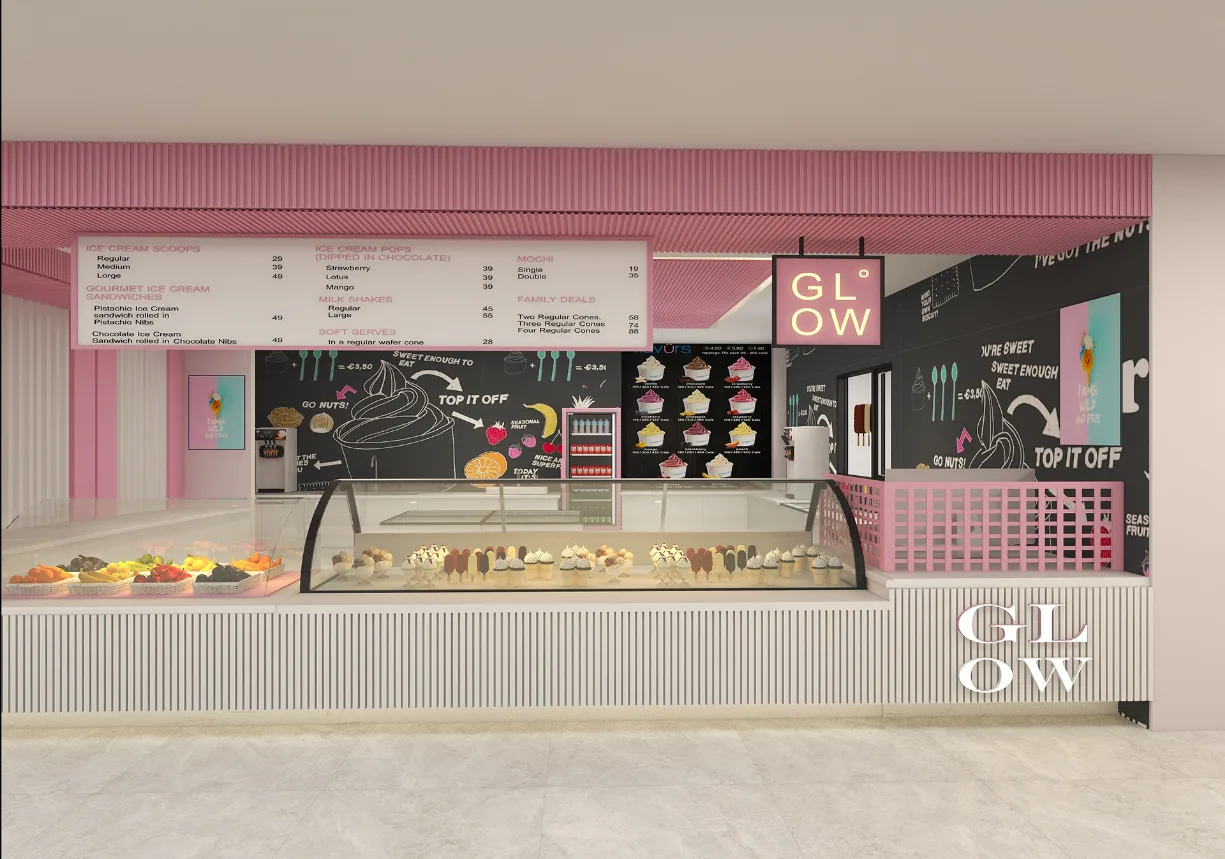
In today’s competitive business environment, store design is not only a space for product display but also an intuitive presentation of the brand image and an important link with consumers’ emotional connection. An excellent store design can attract consumers’ attention at the first time, stimulate their desire to consume, and thus enhance the brand’s market competitiveness. Below, we will conduct an in-depth analysis of this ice cream store design.
Overall style positioning
- The overall style of the ice cream shop is very distinctive, with pink and white as the main colors, creating a sweet, fresh, and vibrant atmosphere. Pink, as a color with great affinity and romance, naturally fits the sweetness of ice cream and can quickly capture the attention of consumers, especially young women and children.
- The extensive use of white not only increases the brightness of the space. It makes the entire store look clean and tidy but also balances the sweetness of pink, avoiding an overly sweet visual experience. This color-matching style not only conforms to the characteristics of ice cream products but also keeps up with the current popular aesthetic trends, giving the store a unique recognition.
Space layout planning
- From the perspective of space layout, the store design is compact and reasonable. The open display area is at the front of the store and is the visual focus of the entire space. The curved glass display cabinet is like an exquisite stage, perfectly presenting a wide range of ice cream products and fresh and tempting fruits to consumers. This display method not only facilitates customers to intuitively choose their favorite flavors but also stimulates customers’ desire to buy through rich colors and diverse shapes.
- Above the display area, a clear and eye-catching menu is hung. The menu lists in detail the names, prices, and specifications of various types of ice cream, as well as preferential combinations such as family packages. This setting allows customers to browse and make choices in advance while waiting in line, effectively improving the efficiency of ordering, reducing customers’ waiting time, and enhancing the consumer experience.
- The operating area at the back is separated from the display area, which not only ensures the relative concealment of the ice cream making process, maintains the neatness and beauty of the store, but also facilitates the operating procedures of the staff when making and taking and placing products, ensuring the efficiency of the service. At the same time, the spacious design of the passages in the store ensures the smooth flow of customers in the store, avoids crowding and chaos, and makes the entire shopping process more comfortable and relaxed.
Integration of brand elements
- Brand elements are fully and cleverly used in this store design. The brand logo of “GL°OW” frequently appears in various prominent locations of the store, such as the sign above the entrance and the side of the display counter. This repetitive appearance can continuously strengthen the brand impression in the minds of consumers and deepen their memory of the brand.
- In addition, the creative hand-painted graffiti and patterns on the wall are also important carriers of brand expression. These patterns are not only highly decorative and enrich the visual level of the space but also convey the brand’s young, fashionable, and creative personality characteristics. For example, some ice cream-shaped patterns and playful copywriting closely echo the theme of ice cream, further enhancing the brand’s appeal.
Conclusion
This ice cream store design has demonstrated a high level of professionalism in terms of style positioning, space layout, integration of brand elements, and detail processing. Through careful design and ingenious conception, it successfully integrates the brand image with the consumer experience. It is an example of commercial space design that combines beauty and practicality.