
Design reference: this page is not presented as a completed Benson Display client project. Use the layout and fixture ideas to describe your own requirements; specifications and project scope need separate confirmation.
Project Overview
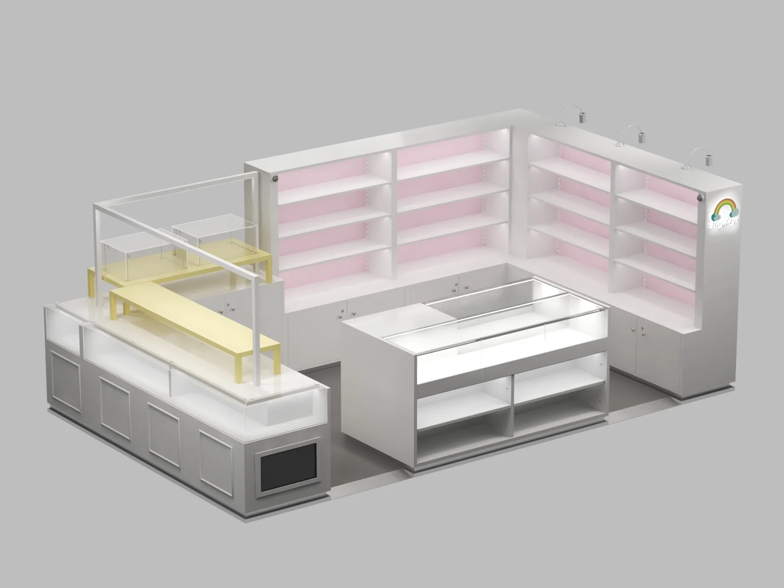
This display system turns shopping into play. Kids reach for toys on their level. Parents browse without bending. Everyone stays longer. We designed this for a toy retailer. They sold blind boxes, plush toys, and small accessories. Their old shelves lined walls flat. Products hid from view. Customers walked past. The new layout changes everything. Three zones work together. Each invites touch and exploration.
Design Concept
Start with movement. Shopping works best when bodies move freely. Static walls force linear paths. Layered podiums create discovery moments around every corner. Add height variation next. Low tables suit small children. Mid-level counters fit adults. Tall back walls draw eyes upward. Every age finds their zone. Finish with softness. Rounded edges replace sharp corners. Pastel tones calm busy minds. Hidden storage keeps floors clear. Safety and beauty share the same space.
Three Zones
- One lines the wall. Tall open shelving rises floor to ceiling. Pink backlight glows behind each shelf. Blind boxes sparkle like tiny windows. Top spotlights pick out featured items. Kids point upward. Parents lift them to see.
- Two anchors the center. Glass walls wrap a square island. Lower shelves sit open for quick grabs. Staff restock from hidden sides. This counter becomes the store heart. Everyone circles it naturally.
- Three scatters nearby. Yellow and wood podiums stand at different heights. Some hold single hero products. Others display collections. Kids climb around them like playground equipment. Shopping feels like adventure.
Material & Color
White covers most surfaces. It reflects light ang makes small spaces feel larger. It lets colorful products pop. Pink adds warmth. Soft blush lines the back panels. It glows with hidden LED strips. This color says friendly. Yellow punches accents. Select podiums wear this sunny tone. Eyes jump to these points. Kids gravitate toward them first. Light wood grounds the palette. Natural grain appears on edges and legs. It connects to home environments. Parents feel comfort, not clinical cold.
Safety Details
- Rounded corners protect small bodies. No sharp edges at child height. Parents relax. Kids explore freely.
- Stable bases prevent tipping. Podiums spread weight wide. Active climbers stay safe. Displays survive bumps.。
- Hidden storage removes clutter. Excess stock lives below sight lines. Floors stay clear for walking. Chaos hides behind clean faces.
Project Outcome
The retailer gained movement. Customers now circulate through all three zones. They touch more products and buy more items per visit. Kids gained independence. Low displays let them choose alone. Parents watch, not hover. Shopping becomes shared joy, not chore. The space gained identity. Rainbow corner signs mark the entrance. Pastel tones photograph well. Visitors share images online. The design markets itself.
This project proves retail can feel like play. Layered heights invite exploration. Soft colors welcome young families. Every detail serves both safety and sales.