Design reference: this page is not presented as a completed Benson Display client project. Use the layout and fixture ideas to describe your own requirements; specifications and project scope need separate confirmation.
Booth Structure and Appearance
Main Structure
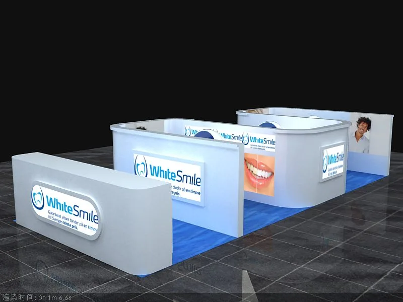
Multiple cabinets of different shapes and sizes make up the booth. Some cabinets have an arc – shaped design with smooth lines, adding a sense of softness and modernity to the visual effect. The surface of the cabinets is smooth, likely treated with a baking finish or a similar process, making them look delicate and easy to clean.
Logo and Display
The “WhiteSmile” brand logo is prominently displayed in eye – catching positions on each cabinet. The logo design is simple, mainly in blue and white, with a tooth – shaped pattern to highlight the brand theme. In addition, there are pictures showing the teeth – whitening effect, such as portraits of people with white teeth, which directly convey the service effect to customers.
Color Coordination
The white cabinets pair seamlessly with the blue floor and decorative strips, creating a striking color contrast. This approach not only highlights the brand elements but also creates a comfortable visual atmosphere, further enhancing the overall customer experience.
Functional Areas
Reception Area
A separate reception counter serves as the main hub for welcoming customers, providing consultations, and handling registrations. The counter is simply and elegantly designed, with a moderate height, making it convenient for staff to communicate with customers.
Operation and Service Area
Judging from the pictures, there is an area inside the booth for teeth – whitening operations, equipped with corresponding equipment and tools. Some cabinets have drawers. Which may be used to store whitening products, tools, and customers’ personal items, providing sufficient storage space.
Rest Area
The pictures show egg – shaped seats, which are unique and modern in shape. This area likely serves as a rest space for customers, offering a comfortable place to wait or relax after completing the whitening service.
Material
In terms of materials, the basic material used is MDF (Medium – Density Fiberboard). It is advantageous because it allows for easy shape – changing during the manufacturing process, enabling the creation of various unique and customized designs for the booth.
The design uses acrylic panels to create the store logo and illuminated light boxes. Acrylic has excellent transparency and durability. It can make the logo look sharp and eye – catching, and for the light boxes. Which can evenly transmit light, enhancing the visual effect of the display.
Stainless steel is utilized for fixation purposes. It offers high strength and stability, ensuring that the structure of the booth remains firm and secure.
The surface coating is glossy lacquer. This type of coating gives the booth a smooth, shiny, and luxurious appearance.
Contatct us :[email protected]