
Design reference: this page is not presented as a completed Benson Display client project. Use the layout and fixture ideas to describe your own requirements; specifications and project scope need separate confirmation.
Pharmacy design
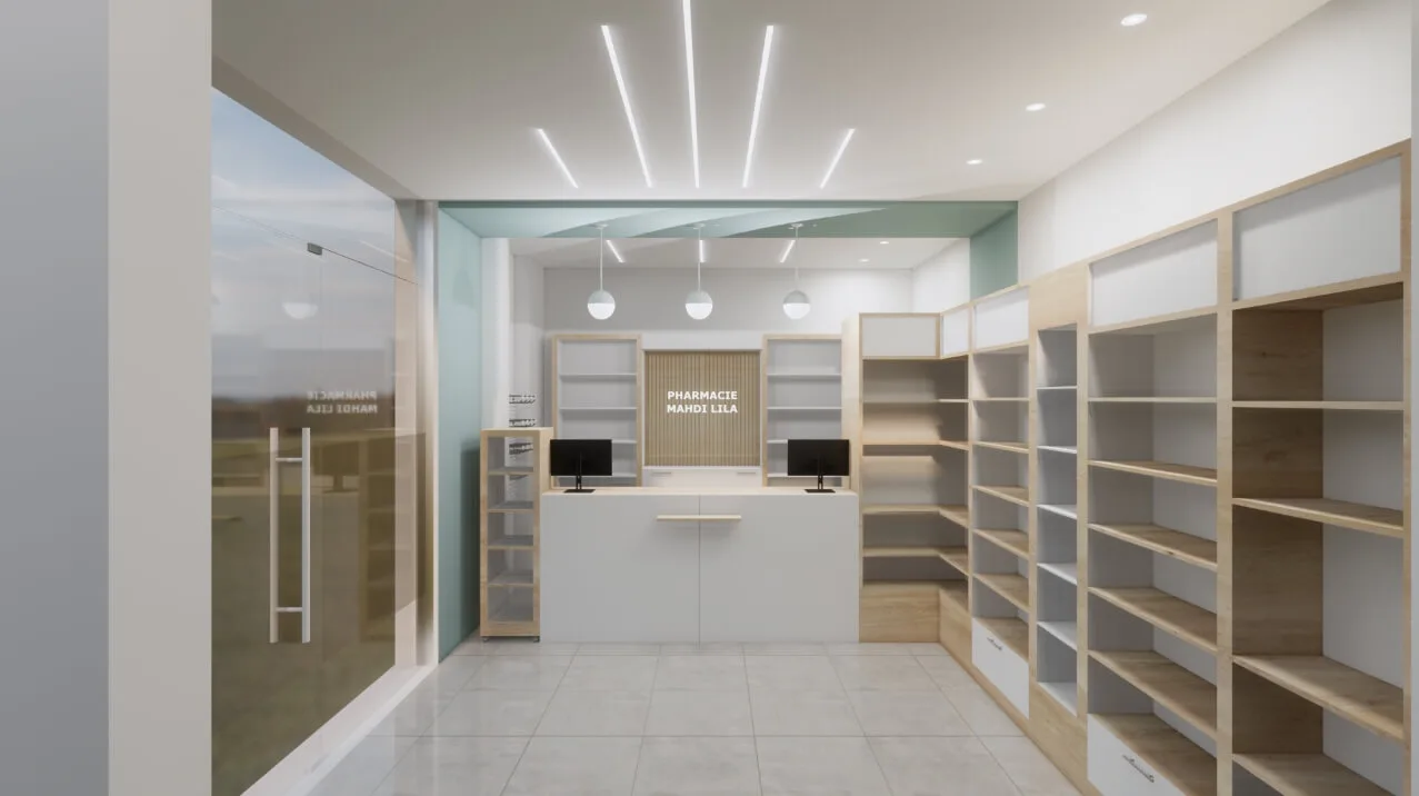
With light wood color, pure white and soft mint green as the core tones, through precise planning of functional zones and humanized refinement of details, it not only meets the full-process functional requirements of “storage – dispensing – display – cashier” in pharmacies shop, but also resolves the sense of estrangement of traditional pharmacies with warm materials and layout, creating a service scene that is both practical and friendly.
Back-end storage office area
- Material use
The floor of the space is paved with large-sized light grey matte ceramic tiles. The gaps on the tile surface are fine and the color is close to that of the tile body. This not only visually expands the depth of the space but also has the characteristics of wear resistance and easy cleaning. This material choice is suitable for the frequent item handling and cleaning needs of the storage area. The main body of the wall is painted with white latex paint, but in the functional core area (behind the cleaning operation counter), mint green vertical patterned ceramic tiles are used for tiling. The vertical texture not only adds detailed layers to the wall but also echoes the accent color of the public area, creating a visual implicit connection between the backstage and front Spaces and avoiding the sense of disconnection in the logistics area.
- Modular design
The storage system in this area adopts a “modular design”, taking into account both openness and storage capacity: on the left is a white metal grid shelving unit. The grid structure has excellent ventilation and is suitable for storing dry packaged medicines or cleaning tools. The height of each layer can be flexibly adjusted to accommodate items of different sizes. Adjacent to it is an open wood-colored storage rack, which is integrated with the mint green tile operation counter.
The countertop of the operation counter is also covered with mint green tiles, forming a unified visual module with the wall tiles. The countertop is equipped with a double-faucet sink to meet the needs of cleaning and temporary adjustment of utensils. The open wooden layer rack under the sink is used to place cleaning supplies or commonly used utensils. It is convenient to take and clear at a glance.
- Operation counter
On the right side of the operation counter, there is a combination of a white closed cabinet and a natural wood-colored desk: The white cabinet adopts a handleless design and can be opened by a push-type rebound device, maintaining a simple and tidy visual appearance. The interior can store private files or fragile items. The wooden desk provides a temporary working area for employees. It is equipped with a black monitor and a file storage area. The wooden frame on the side and the white cushioned dining chair strike a balance between comfort and style consistency.
The details in the corners of the area are also in line with practical needs: small microwave ovens are placed on the wall-mounted embedded shelves to meet the basic living needs of the employees. The stacked cardboard boxes and filing cabinets in the corner hint at the storage capacity expansion function of this area. The diagonally arranged wooden ladders point to the upper attic space, further expanding the storage area. The ladders are made of pure wooden material without any superfluous decoration, which is highly consistent with the overall natural style.
Front desk public service area
The entrance adopts a fully transparent glass door design. The door body is equipped with a simple white long strip handle, which not only ensures the transparency of the space but also meets the ergonomic grip requirements. The surface of the glass door is printed with the white words “PHARMACIE MAHDI LILA” in reverse. The name of the pharmacy can be clearly identified from the outside without blocking the view inside. The wall beside the entrance is partially painted with mint green latex paint, which echoes the color tone of the tiles in the background area, making the color system of the space more complete.
The lighting in the entrance area adopts a “main and auxiliary combination” approach: the ceiling is equipped with long strip LED light strips (main lighting) and recessed downlights (auxiliary lighting). The long strip light strips provide uniform and bright light, while the recessed downlights supplement local lighting, avoiding light dead zones and making the entrance area both bright and non-dazzling.
Front desk area
The front desk is the visual core of the public area. It adopts a combination design of “white lacquered cabinet body + light natural wood countertop” : the surface of the white cabinet body is smooth and easy to clean, and the hidden design without handles makes the overall lines more simple. The light wood countertop neutralizes the coldness of white, bringing a natural and warm atmosphere.
On the side of the countertop close to the customer, a small wood-colored extension board has been added. This humanized detail allows customers to temporarily place their personal bags, prescription receipts and other items, avoiding the inconvenience of holding items and enhancing the convenience of service.
- Area design
Behind the front desk is the dispensing area, which is demarcated by wooden grilles. The transparent design of the grilles not only ensures visual communication between employees and customers but also provides a moderate level of privacy protection for the dispensing area. The white “PHARMACIE MAHDI LILA” logo is printed in the center of the partition, enhancing the visual presentation of the brand. The medicine storage rack behind the partition also adopts a design of a light natural wood frame and white shelves.
The height of each layer is customized according to the size of the medicine packaging: the upper layer is used to place small boxed medicines, the middle layer is used to place bottled medicines, and the lower layer is used to store commonly used medicine preparation tools. The classification is clear, making it convenient for employees to quickly take and put them away.
- Light design
The lighting design in the front desk area is rich in layers: the long LED light strips on the ceiling provide basic lighting, while the three spherical chandeliers hanging above the front desk create a warm and cozy local atmosphere with soft warm light. This not only enhances the visual focus of the front desk but also allows customers to feel a more comfortable lighting environment when consulting.
Shelf display area
The shelf display area is arranged along the walls of the public area, forming a circular display layout. This not only maximizes the utilization of wall space but also leaves a spacious central passage, ensuring smooth movement for customers.
- Shelves detail
The shelves adopt the same material combination as the front desk and the medicine dispensing rack, which is “light wood color frame + white shelves”, maintaining the unity of the space style. The layered design of the shelves is highly practical: the upper area is of moderate height, suitable for displaying small packages of OTC medicines, health products, etc., making it convenient for customers to take them.
The middle area displays medium-sized medicine packaging, such as boxed topical medications and household medicines. The lower area not only features open shelves but also adds white closed drawers – the drawers are designed with hidden handles, allowing for the storage of inventory medicines or larger packaged items inside. This not only increases the storage capacity but also avoids the clutter of the space.
- Classification design
Judging from the display effect, the medicines on the shelves are placed by category (such as health products in green packaging, care products in purple packaging, and commonly used medicines in red packaging, etc.), and combined with bright lighting, customers can quickly identify the items they need, improving the shopping efficiency. The natural wood color and white base color of the shelves also make the colors of different packaged medicines stand out more, while not creating a visual clutter.