
Design reference: this page is not presented as a completed Benson Display client project. Use the layout and fixture ideas to describe your own requirements; specifications and project scope need separate confirmation.
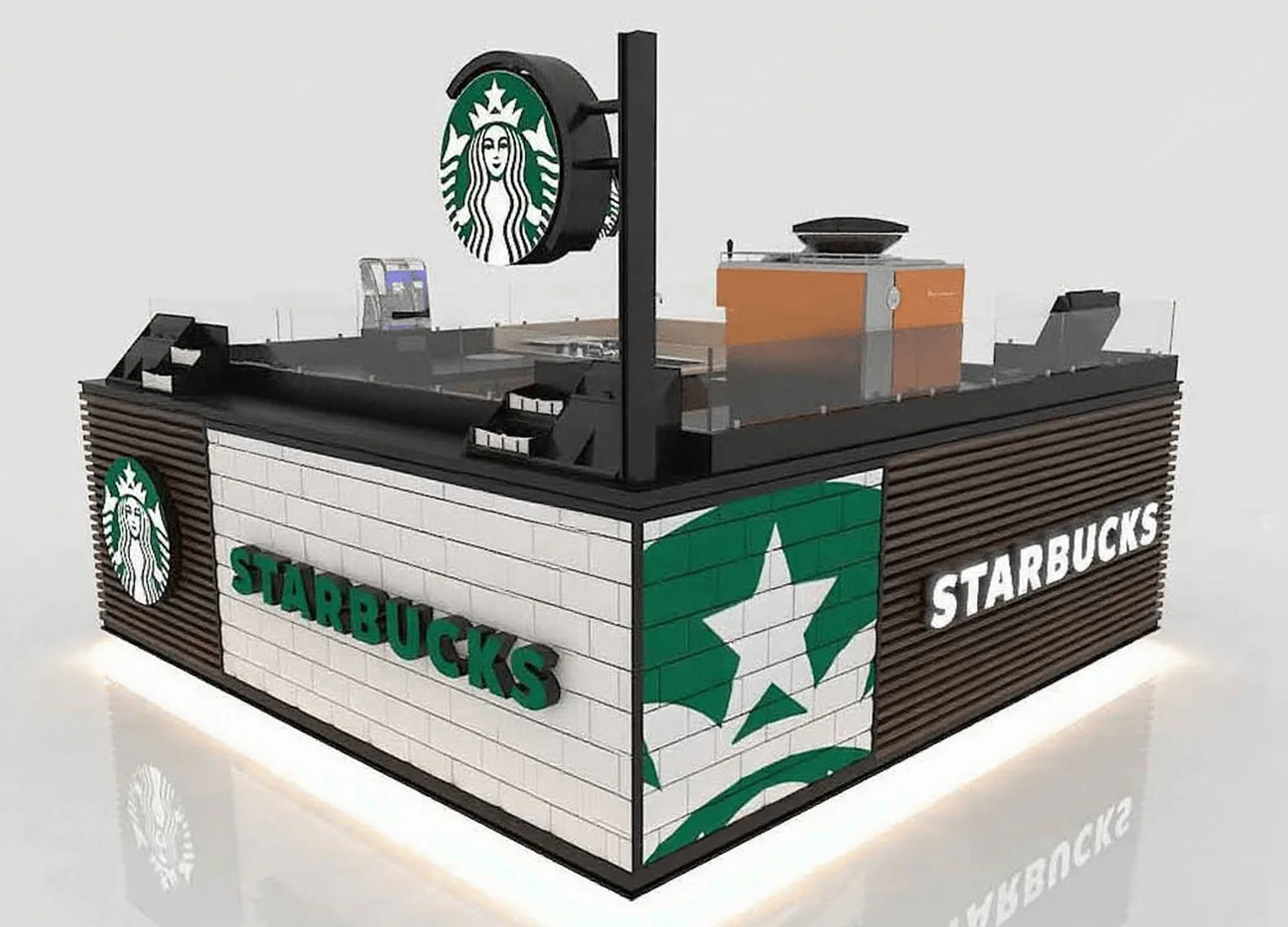
In shopping malls, it’s always very easy for us to identify the location of a Starbucks coffee shop. It is because Starbucks coffee shops can stand out from other coffee shops with their unique designs. It breaks the traditional design of coffee. Next, let’s take the Starbucks kiosk as an example and introduce it to you from aspects such as design, layout and materials.
Design appearance
The size of this Starbucks kiosk is approximately 10*10ft and it has a square structure. In terms of color application, black, white and green are the main tones, which are consistent with the color matching of the logo. We set a double-sided circular light-emitting box with a diameter of 1 meter at the diagonal top, pairing the central white mermaid logo with a green background. For the cabinet body, we surround it with white tiles and dark brown striped checkered boards, and decorate it with the exclusive Starbucks logo, a five-pointed star graffiti. The front features a three-dimensional acrylic character “STARBUCKS” with an LED backlight inside. There is a 3-cm-wide RGB light strip at the bottom that can switch colors. We surround the cabinet with grey frosted glass panels on all sides, adding a sense of mystery to the manufacturing process.
Layout planning
The interior is planned with a “U-shaped circulation” to create a space of 6 to 8 square meters, which is divided into the operation area and the cashier area. We equip the operation area with 2 commercial coffee machines, an intelligent coffee grinder, and a refrigeration cabinet. We embed these devices inside the cabinet, and design the operation console at a height of 85cm to conform to ergonomics.The brown storage cabinet below stores coffee utensils and materials. On the right is a double sink for cleaning appliances. The counter is equipped with a constant-temperature preservation layer. The cashier area integrates an intelligent POS system and scanning code payment terminals. We surround the kiosk with 8mm frosted glass on all sides. We also place two small stepped acrylic storage racks outside for sugar packets, straws and other items, making it convenient for customers to take them as needed.
Material usage
We make the main body of this Starbucks kiosk from plywood. We use fireproof board for the counter inside the cabinet and a black artificial stone for the countertop.The outside is covered with white tile-style panels, which echo the brand’s freshness with a simple texture, brightening the appearance and enhancing recognition. The wood grain stripe design neutralizes the coldness and aligns with the brand’s comfortable tone. The logo is an acrylic backlit logo, featuring high transparency, light weight and wear resistance. During the day, it appears three-dimensional and exquisite, and at night, it catches the eye from a distance with its backlight. At the same time, we appropriately use some metal elements in the entire design for combination. We electroplate and paint the metals to prevent oxidation and rusting.
Summary
This Starbucks kiosk has a very distinctive design. Structurally, it is based on plywood, combined with fireproof boards and metal objects. Visually, we combine the main colors of black, white, and green with illuminated signs to form a strong memory point. Brand communication permeates consumer scenarios through elements such as acrylic backlit logos and wood grain textures. This model that organically integrates “standardized visual symbols + U-shaped circulation layout + high-specification materials”. It not only maximizes the utilization of space but also makes the brand image vivid and lifelike.