
Design reference: this page is not presented as a completed Benson Display client project. Use the layout and fixture ideas to describe your own requirements; specifications and project scope need separate confirmation.
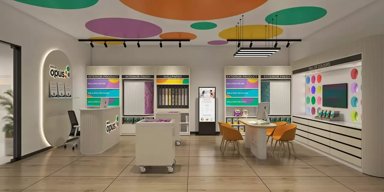
The design of Opus Paint Shop expertly navigates the retail challenge of merging visual appeal with practical function. Instead of a chaotic environment, the space adopts a philosophy of playful modern minimalism. Clean lines and neutral base tones like ivory and light wood create an uncluttered, polished backdrop. This approachable aesthetic intentionally avoids overwhelming customers, thereby guiding them comfortably through the color selection journey.
Furthermore, strategic bursts of vibrant color directly tie the minimalist space to the brand’s core product. Bold pops from ceiling accents and the signature color wall break the neutrality, creating focal points. Consequently, the entire aesthetic feels cohesive, where every design choice supports the immersive experience of exploring paint and color.
Prioritizing Functional Displays
Every fixture within Opus is tailored for practicality and brand cohesion. The primary display shelving utilizes sleek, white matte MDF to maintain a durable and uniform base. Sizes are carefully considered, with floor-to-wall units maximizing vertical space and lower, shallower shelves ensuring paint cans remain within easy reach for customers.
Additionally, the layout smartly balances open and closed storage. Open shelving guarantees product visibility, while integrated cabinets provide essential hidden storage. Meanwhile, specialized wall-mounted displays with slim, recessed racks keep sample materials like wallpaper rolls orderly and accessible. This meticulous planning ensures the space remains tidy and highly functional for both browsing and operations.
Creating Interactive Experiences
The shop’s design deliberately transforms standard product viewing into an engaging interaction. This is most evident in the iconic “Hall of Colours” wall, which serves as the store’s focal point. Here, circular backlit swatches allow customers to visualize shades vividly and at a glance, a feature complemented by integrated digital tools for color matching.
Similarly, mobility is key to the interactive experience. Compact, wheeled carts act as flexible workstations that staff can move anywhere. This design choice directly facilitates personalized service, allowing associates to easily bring samples or tools to customers. Ultimately, these elements encourage exploration and hands-on decision-making.
Weaving a Color-Centric Narrative
Every decorative detail reinforces the brand color and creativity. For instance, the large, matte-colored circles suspended from the ceiling are more than whimsical art; they physically represent popular paint shades. This clever tactic embeds the product into the architecture itself, continuously reinforcing the theme without cluttering the primary walls.
Finally, strategic lighting and branding elements solidify the immersive environment. Track and pendant lights ensure accurate color perception on every sample and product. Moreover, subtle logos and color-coded signage throughout the space provide quiet but consistent brand reminders. The result is a deeply cohesive environment where customers are seamlessly guided by both function and a vibrant identity.