
A high-traffic location and a high-performing ice cream kiosk are not the same thing. People may pass the counter without wanting dessert, or stop to read the menu without joining the queue. Treat visibility, ordering and service as separate questions. The kiosk design can be planned around those questions, but its appearance alone does not establish demand or guarantee sales.
Begin with a site drawing and observations from the hours you intend to trade. Note the main approach directions, neighbouring attractions and the space available around the counter. Use these observations to develop a testable layout brief rather than selecting a decorative shape and assuming the customer journey will fit around it.
Understand how people approach the ice cream kiosk
Mark the directions from which visitors first see the unit. A corner position may need a different sign arrangement from a counter viewed mainly from the front. Identify what blocks the view, including nearby structures, temporary displays and people standing at the counter.
Review a proposed elevation from these approach points. Ask whether someone can identify the product category before reaching the ordering position. Keep the planned signs within the venue's approved limits, and confirm those limits rather than assuming a suspended sign or oversized feature will be accepted.
Give the menu a clear place in the layout
Decide where customers should read the flavours, serving formats and prices before ordering. Place that information in the layout drawing, not just in a later graphics file. Check how the menu will look when someone else is being served and which parts may be hidden by the display equipment.
Separate the main choice from secondary information. For example, a menu can identify the available formats while labels near the display identify individual selections. Use a mock-up with your actual text to check readability from the intended position. Do not rely on placeholder lettering that is shorter than the final menu.
Distinguish ordering from collection
Mark where a new customer joins, where the order is placed and where the finished item is collected. These points may be close together in a small kiosk, but they should still be considered separately. Add space for companions and for someone who needs more time to make a choice.
Review the resulting queue with the venue, including busy periods and neighbouring circulation. A long queue is not proof of successful design; it may also reflect slow service or uncertainty. Avoid using decorative props to occupy space that the agreed customer route needs.
Plan equipment access and replenishment
Use the selected equipment's installation information to lay out the working side. Show lids, doors, service panels and any required clearances. A drawing of a freezer inside a counter does not confirm that the surrounding enclosure is suitable for it.
Walk through serving, payment, restocking and cleaning with the people who will operate the kiosk. Mark where packaging and frequently used supplies go. Confirm food-handling and equipment requirements with the relevant specialists; the fixture brief should record those requirements, not replace them with assumptions about a pictured design.
Use themed details with a defined purpose
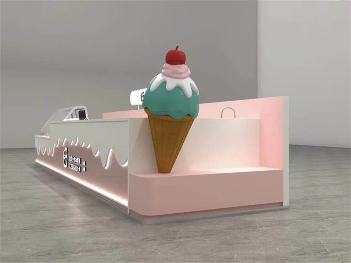
An oversized cone, a curved front or a distinctive colour palette can form part of the brand direction. Give each feature a reason to be there: identifying the product category, carrying the logo or framing the serving area. Then check whether it interferes with menus, equipment access or the agreed footprint.
Review finish samples and lighting with the surrounding interior in mind. Ask how the proposed details will be cleaned and repaired. Neither a rounded shape nor a particular colour establishes safety compliance, resistance to marks or a measurable increase in customer interest.
Measure the result before expanding the idea
Plan a simple observation record for comparable trading periods. Distinguish passers-by, people who stop, orders placed and the time spent waiting. Record changes to the menu, staffing or nearby events alongside the counts, since those differences can make a layout comparison misleading.
Use the observations to identify a specific question, such as an obscured menu or confusion at collection, and test a focused change. A small trial is more informative than attributing every result to the kiosk's appearance. Browse ice cream kiosk references for visual direction, then send Benson Display your site and service brief to discuss the fixture requirements without treating a reference image as a promised commercial outcome.